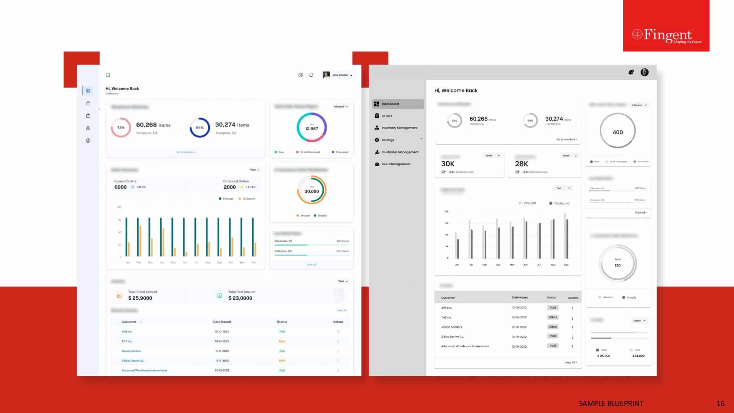
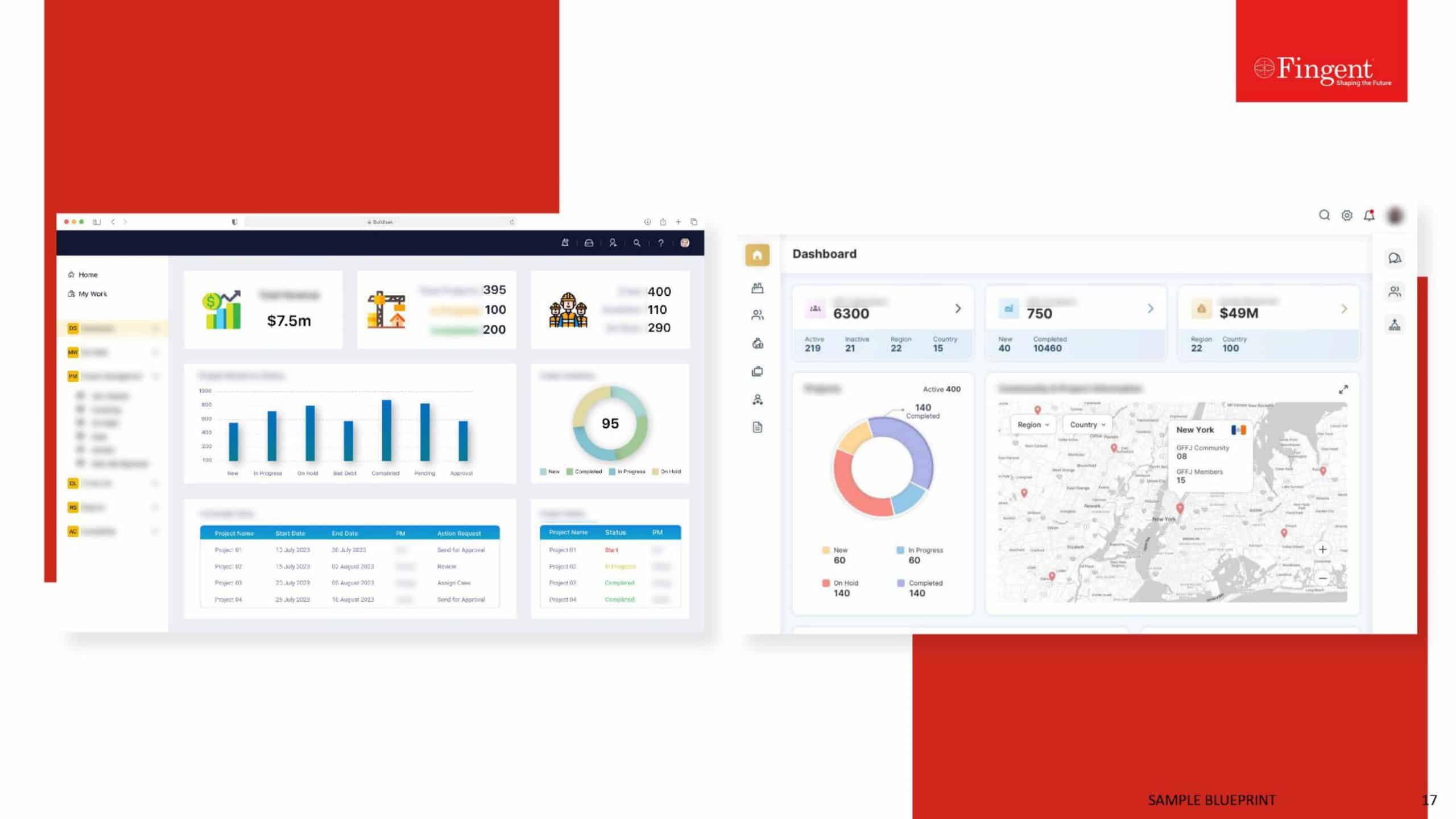
Is Good UI Necessary To Retain Your Customers?
Before I give a definite yes or no to this question, let’s understand the concept of User Interface or UI.
Remember back in the days when owning a Gameboy was as good as an Xbox now, when 30 minutes of Super Mario Land was as intense as a game of graphically dense Far Cry 5 today? Or how uber cool it was to hit your favorite music on a Sony Walkman while you browsed through your myspace account?
Fast forward to 2019, where software is more intelligent and much better looking, even the older millennials cannot ditch their Xboxes to go back to the Nintendo DS nor can they return to myspace from Instagram. Did they love their Nintendos? Yes. Did they enjoy using it even though it wasn’t as graphically demanding? Yes. Then what changed?

All thanks to better UI designers.
Related Read: The Power of UX and UI in Delivering Successful Digital Assets
What Is UI?
UI or User Interface is simply the link between your customer and your product. Whatever elements your customer can see, touch or feel to navigate through your product can contribute to the User Interface. Be it the mobile phone we use, the smartwatch we wear, the car we ride or the websites we use. Everything has a User Interface.
Talking about software, do customers really care what your software looks like or do they just want any platform to get their work done quickly?
The answer is Yes. Customers do care about the interface you provide. Are they aware of it? Probably not.
Psychologically, most users aren’t consciously aware of the interface they use to navigate through the software. It is through their experience on your website that they decide whether to stay or leave. This is where the importance of User Experience or UX comes to play. A well thought of User Interface can subsequently lead to good user experience and can undoubtedly help you retain your users.

Here are a few points that you need to keep in mind when you design your next product to help you retain your customers/users.
1. Take Time to Research
This is one of the most underrated steps in the software design process. Many product teams focus on having the requirements in place and getting work started without “wasting” time. Little do we realize that spending those extra hours in user research and understanding the end user, can do wonders for your product.
Nowadays companies even consult with independent UX research companies that conduct user interviews, focus groups, personas, etc. for them. According to Forrester Research, a good user-centric design has proven to boost ROI and bring up conversion rates by up to 400%.
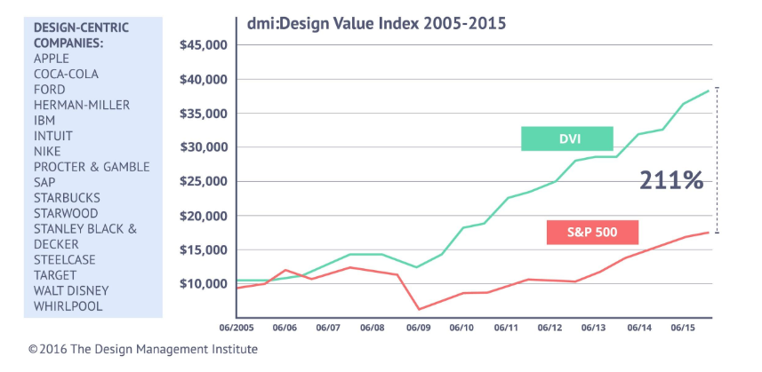
Moreover, in a study by the Design Management Institute, “design-centric” companies outperformed the S&P 500 by 211%.
Source – The Design Management Institute
It is imperative that the product that is being delivered to users cater to their needs, accommodate their goals and reflect their behavior in order to make them use your product. A design that does not take into account what the customer wants will only prompt them to move away from your product.
2. Make Educated Decisions
Needless to say, it is absolutely crucial that design teams are aware of the latest trends in software design and are up to date with the current design principles. As a designer, you simply cannot afford to offer a dated solution to your user. So make sure your product team takes that extra step to study what solution your competitors are offering for the same problem and try to come up with a better solution.
This does not mean you need to go over the top with new ideas and designs. For example, a trash can icon is synonymous to “Delete” in the digital world and replacing that with any other fancy icon would only confuse your user.
Some very well thought UI creations that come to my mind are
- Charlie AI
- Samsung SDS Flow
- Airbnb
- Bellroy
- ESPN Sports Programming
3. Use a Style of Communication that Suits Your Audience
Understand your user base and use a communication style that best suits their age and interests. Say for a children’s website or a fashion e-commerce application, a dull downbeat communication style might not sit well with your younger audience and could force your customers to move on to an application they can relate to emotionally.
On the other hand, a professional network like LinkedIn will require a precise and formal tone as the larger audience on it are strictly there for professional reasons.
Using a tone that makes sense to your audience is very important to capture their attention and build trust with them. Users like to know the “people” behind the software and the tone of your website does just that.
4. Consistency is Key
Like we talked about setting a communication style for your website, it is just as important that this style is maintained throughout the website. The importance of being consistent cannot be stressed enough when it comes to optimal user experience. Users tend to use applications that are consistent in their elements, color scheme, typefaces, and interactions.
Say, if your application displays notifications on a side panel, maintain all notifications on the side panel throughout the site. Believe it or not “Your users don’t like surprises”.
5. Include a Knowledge Base
Let’s explain this with an example. Patrick wants to use your application. He loves the concept and the UI design. He can’t wait to start using your app as he has heard it is perfect for his needs. But Patrick has no idea HOW to use your product. He searches for a guide to help him, but found none. Disappointed, he had to move to another application that had a detailed manual.
Now, losing a customer like Patrick is such a shame. Had you spent that extra effort to create a beautifully crafted knowledge base that explains every functionality and feature of your app, you would have retained millions of users like Patrick.
Understand what your users are looking for. If you don’t want to maintain a separate knowledge pile for this, you can add all the information you want to show the user in the UI, by making it seem less like a knowledge base but more like an intuitive design. You could even integrate an AI bot to answer popular queries for you instantly.
When customers are able to find answers to their questions easily and without having to Google/Quora for answers, the overall customer satisfaction increases and also increases user engagement on your website.
Related Read: CTOs Guide – How Robotics and AI Can Improve Customer Experience
6. Less is More Vs More is More
Minimalism isn’t just a fancy word for lazy design. A minimalist design is a visual concept that seeks to embrace simplicity in design, in order to rope in users only towards what is most important.
When catering to a mature target audience, minimalism can be more attractive than a page full of creative design elements, sliding panels, glittering headlines, and modish popups. If your aim is to urge your customers to focus on a particular set of products, minimalist design is the path to choose.
However, it is crucial to understand your customers here. A minimalist design may not work as well for software designed for children, like an educational game. Younger audiences probably would not understand the aesthetic that you are trying to create and may move away to a more attractive website.
7. Improvise and Adapt – The Secret Sauce of Software Design
This is probably THE most important point that businesses need to keep in mind in order to retain their user base for years.
According to a survey by Skype, Adobe, Norton, and TomTom, less than half of the technology users do not like to upgrade software when they should. The simple reason is that people are comfortable with the way things work and do not want to risk getting an update until it’s proven to work for someone else.
On the contrary, users are attracted to new features and functionality as well.
So how do we ensure our software stays on top of its game to an audience that are hesitant to upgrade but wants new stuff too?
Let’s look at the case study of a simple messaging software.
Starting with a messaging platform to simply connect with friends and family via text messages, the team introduced push notifications on mobiles to ensure messages are received even when the application is not running in the foreground. Once the application garnered a few users, more features like photo and video sharing were added and while they were at it, some edit and filter features were included too. Once the application turned out to be an indispensable communication tool for its users, they added voice and video call features.
At this point, users were receptive to all these subtle changes because they hadn’t realized that the application as it was in the beginning, had completely transformed into something much bigger. As far as the customers knew, their experience on the application was flawless. Once the users were comfortable with the current working, the team added group conferencing and even payment integration. Finally, what started as a simple one-on-one messaging app had the potential to replace at least 4-5 apps that were needed every day.
This is the story of how the messaging giant “WhatsApp” increased its user base from a humble 250,000 users to more than 1.5 billion active users standing right next to Facebook and YouTube.
Takeaway – Start by building trust with your customers. Be attentive to your customer’s needs and incorporate improvements without overwhelming the users.
Some popular applications that have evolved into tech giants over time are
- Google Suite
- Adobe Photoshop
- Amazon
- Windows
- Android
- SAP
- iOS
Knowing how to improvise and adapt is the reason these intelligent businesses remain relevant in the market for years.
Related Read: How AI is Redefining the Future of Customer Service
Summing Up
Coming back to the beginning of this article, we asked you why millennials are unable to switch back to older technologies even though they enjoyed the UI at that time. Gameboys for one, were well researched, were consistent, came with a detailed manual and had a great design given the technological limitations of that age. Where they failed to deliver was improvisation. Users are always looking for the next big technological breakthrough.
To stay on top of your game, you must be open to enhance your product for improvements and cater to the continuous cycle of changing customer demands. Product teams should focus on providing users with a flawless experience, be it through the user interface, functionality or customer service. A user-friendly UI is a catalyst for building good relationships with your customers. Retaining your users become easy when you have earned their trust by consistently meeting your customer’s expectations.
By building sustainable software that sees well into the future, we at Fingent top custom software development company, believe our partners deserve the best that technology can offer. Feel free to contact our consultants to get an insight into how we work to deliver your dreams.
Stay up to date on what's new

Recommended Posts

30 Jul 2023 B2B
SAP Customer Experience: Creating Seamless Omni-Channel Experiences
Businesses find themselves at a critical juncture as customer expectations soar and their loyalty hangs by a thread. The key to captivating and retaining customers lies in mastering the art……
11 May 2023 B2B
Boosting Customer Experience: The Power of AI in Customer Experience
“A simple rule: always give people more than they expect.” - Nelson Boswell The cycle of business starts and ends with customers. Keeping them satisfied and happy is the……

14 Feb 2023 B2B
How AI and ML Are Reshaping Customer Experiences
No longer the stuff of science fiction, artificial intelligence (AI) and machine learning (ML) are revolutionizing the way customers interact with brands. Businesses that have embraced these technologies can reshape……

24 Oct 2022 B2B
Providing Seamless Customer Experience with Technology
Customer Experience – Two words that could make or break your business. Today, customers expect businesses to provide nothing short of an excellent customer experience whenever and however they shop.……
Featured Blogs
Stay up to date on
what's new


